We’re considering switching from Menti beacuse of your better google slides integration. However, one thing that is holding me back is the open ended question format. Here Menti allows to show much more on one slide: 
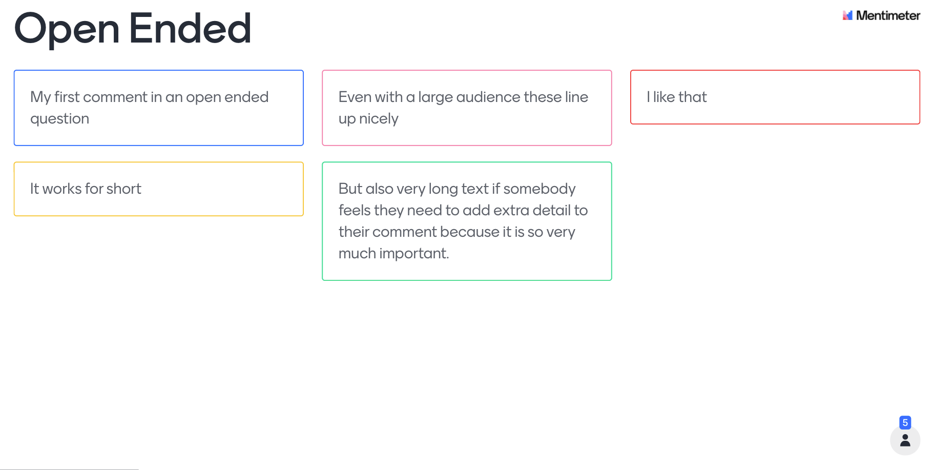
 

Maybe this is something you can add/improve on slido?

Hi @basilweibel,

Thank you so much for your feedback!


You can try using our Open text poll for open-ended questions. While the answers from your audience will sort in a list form as opposed to in line or in multiple columns, you can simply scroll through the list in Present view and even longer responses will be nicely visible. 


Let me know if this could work for you or if you have any other questions :) 


Hi Alex,

thank you for your reply. Yes, I understand the scrolling, but that is exactly the problem. Have you ever seen a good slide that involved scrolling? I think scrolling is the last thing we want to have on a slide.


So the longer we can avoid it the better. Menti makes much better use of the screen real estate here and we use this feature all the time.


So it would be great if you could arrange the boxes first and only once the slide is full start the scrolling. If you could share this with the product team, that would be greatly appreciated.


Greetings,

We have the same thoughts about this as @basilweibel, however the situation persists.

Its there a workaround already?


Hello @APS 

currently our open-ended question is still showing as a list and the presenter needs to scroll down. 

The only workaround could be using word-cloud but then the answers would be shown just as simple words grouped according to the frequency they were submitted.

These inputs are always gathered and forwarded to our product team however at the moment there is no plan to change it in the near future. 


Reply